Final Posters
Audio Pixel Collider
November 2025 - 3 weeks
Project Prompt
As part of my design residency I was commissioned to create a
series of posters for UT Austin’s annual Audio Pixel Collider.
For this years event UT had the honor of partnering with the one
and only Armadillo World Headquarters.
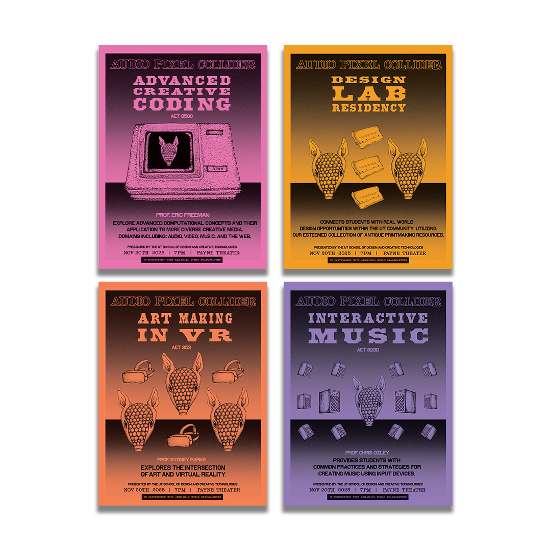
Eight of the posters created represented a class on display from
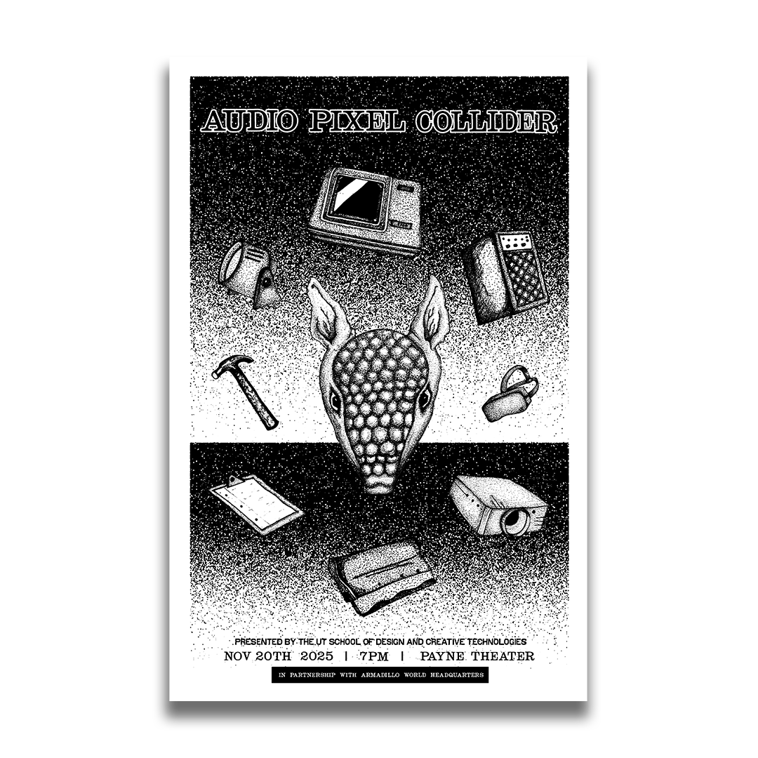
the event. The final poster was created as a souvenir poster for
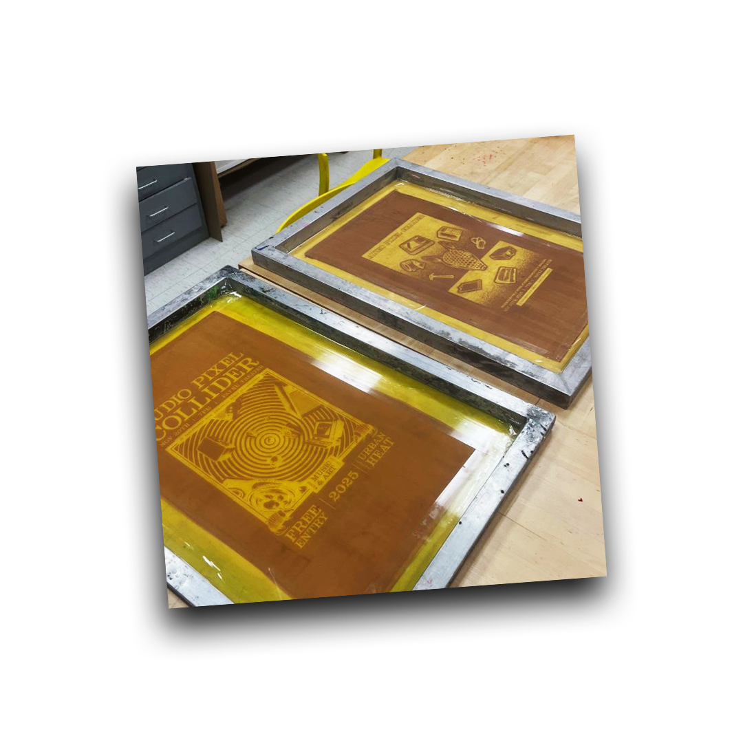
all attendees to take home that we would live print at the event!
Mediums
Illustrator
Photoshop
Screenprint
Button marker
Pen + Pencil
Wait, who is this Armadillo World Headquarters?
Before even beginning this project it is essential for one to know
and understand the importance of the Armadillo World HQ in
regards to Austin’s History.
AWHQ and its beloved patrons are what made Austin weird!
The dillo would come to help cement Austin as the Live Music
Capital of the world and would be responsible for uniting a
population that was divided via politics and lifestyle and brought
them together through art and music.
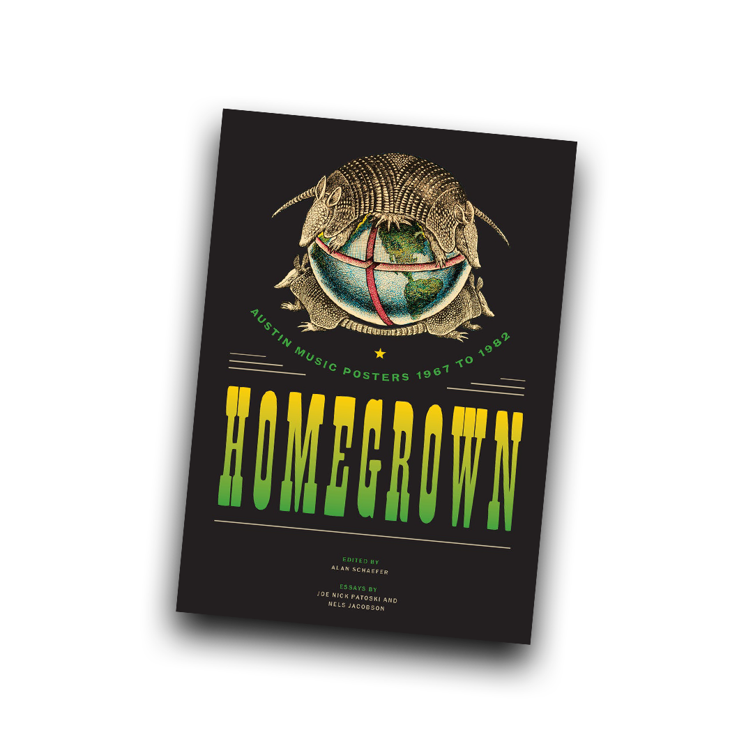
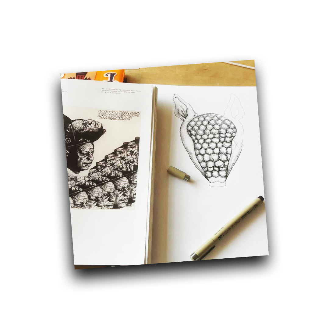
As I went into the project it was vital that I studied the AWHQ’s Art
squad who was responsible for shaping Austin’s visual identity,
(one of which many folks riff off of today).
The book I used as my main source of research
Part 1 - Final class posters
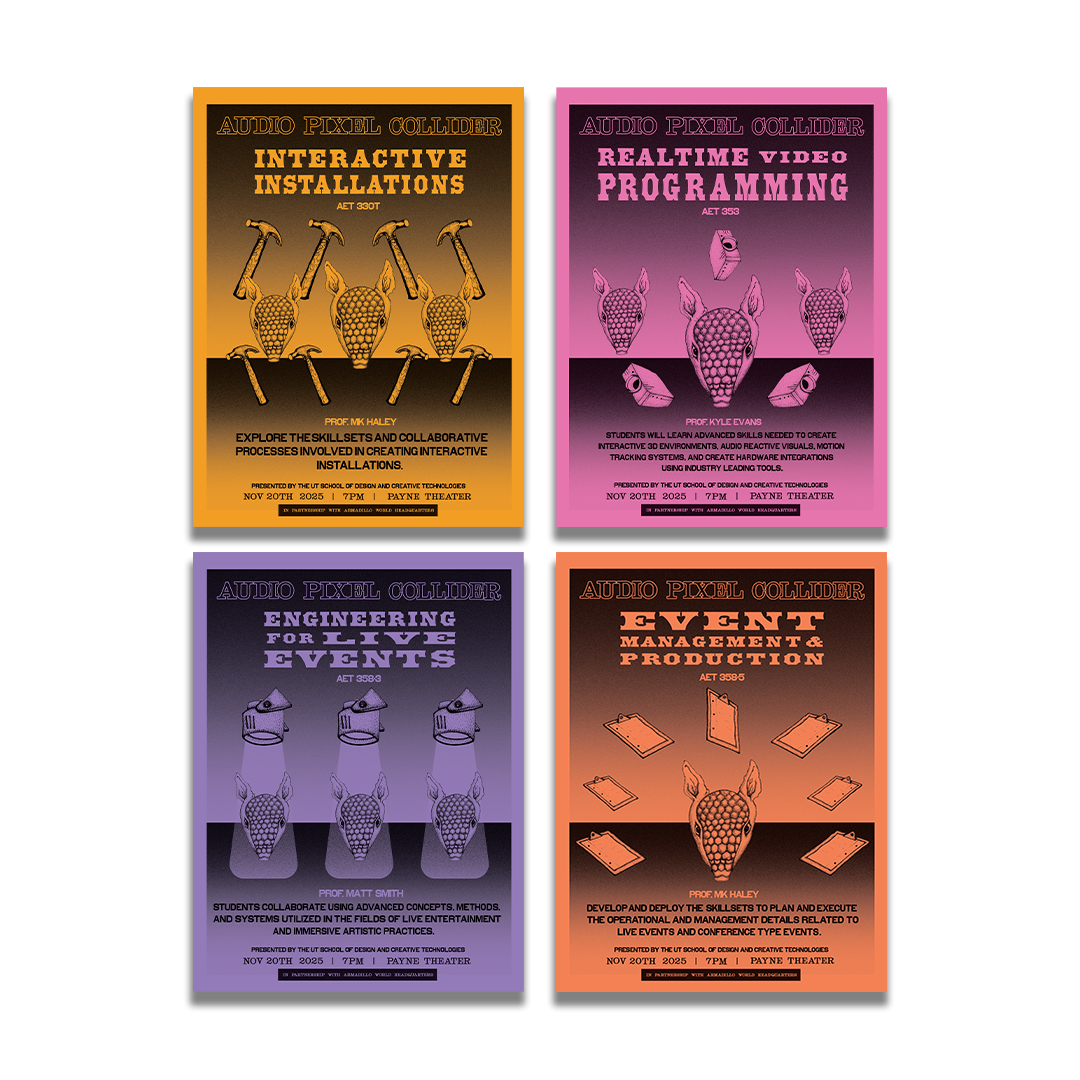
The following posters are the final set that was printed to
represent each class that was on display.
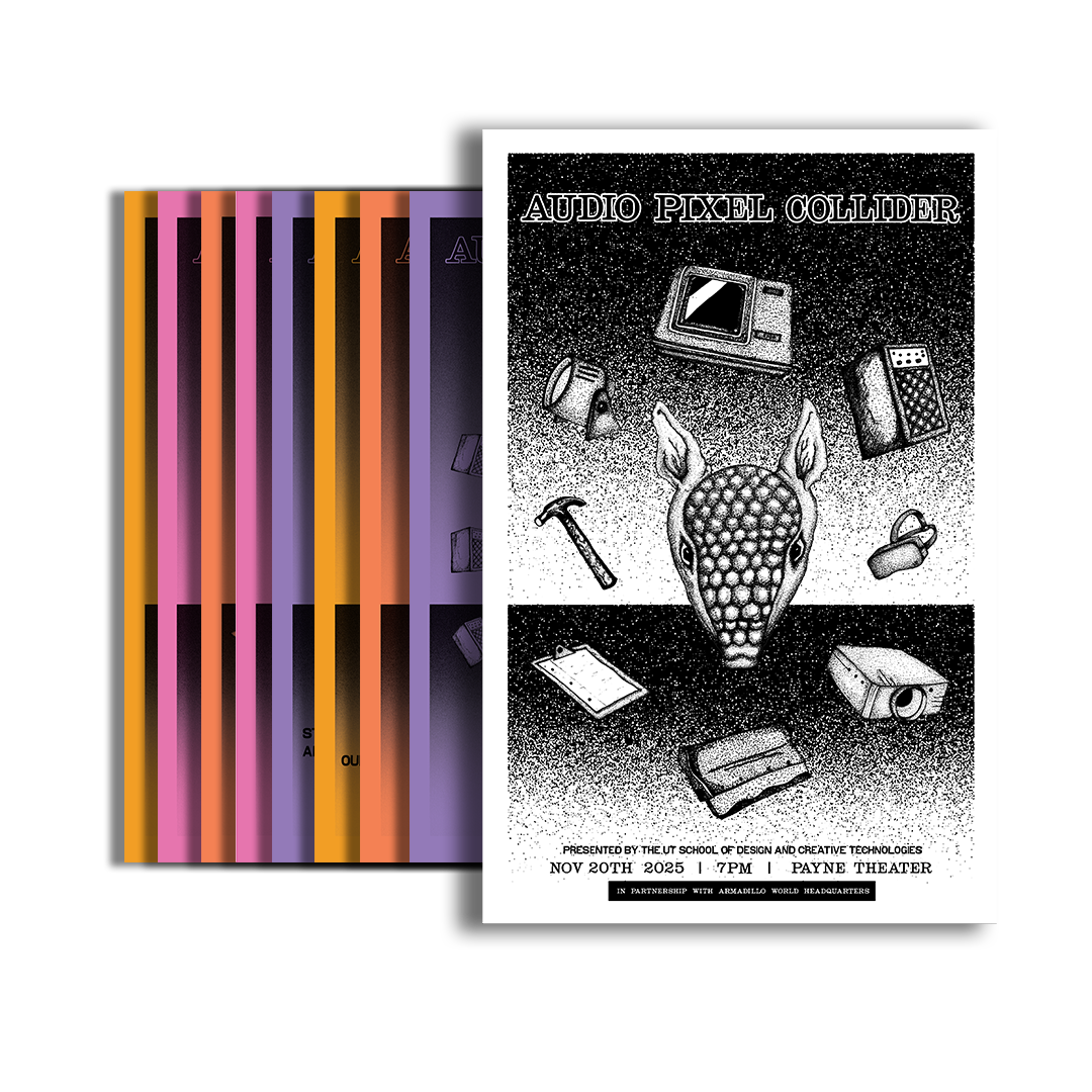
Part 2 - Final event poster
The last poster in the project was created as a takeaway for each
attendee to take home that would I would print live at the event.
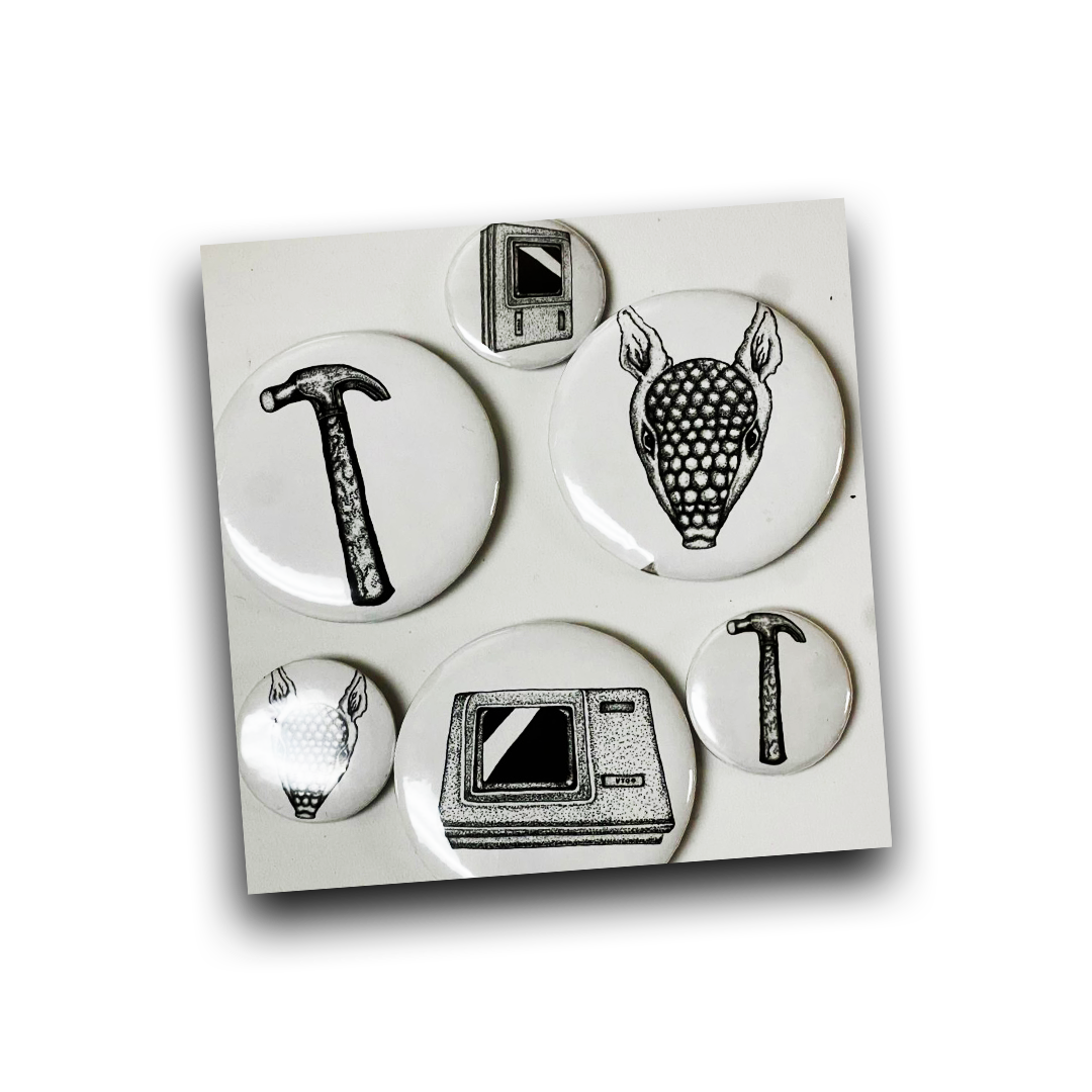
Process Pics
AWHQ Doc - trailer
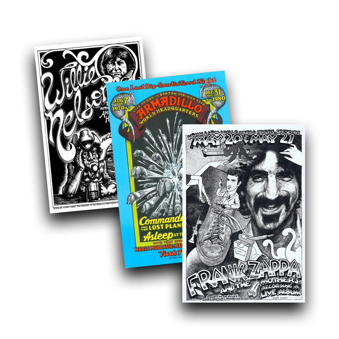
A few posters I was inspired
Final Riso Poster
SXSW Radio Day Stage
March 2026 - 2 weeks
Project Prompt
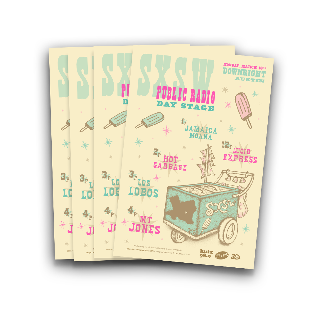
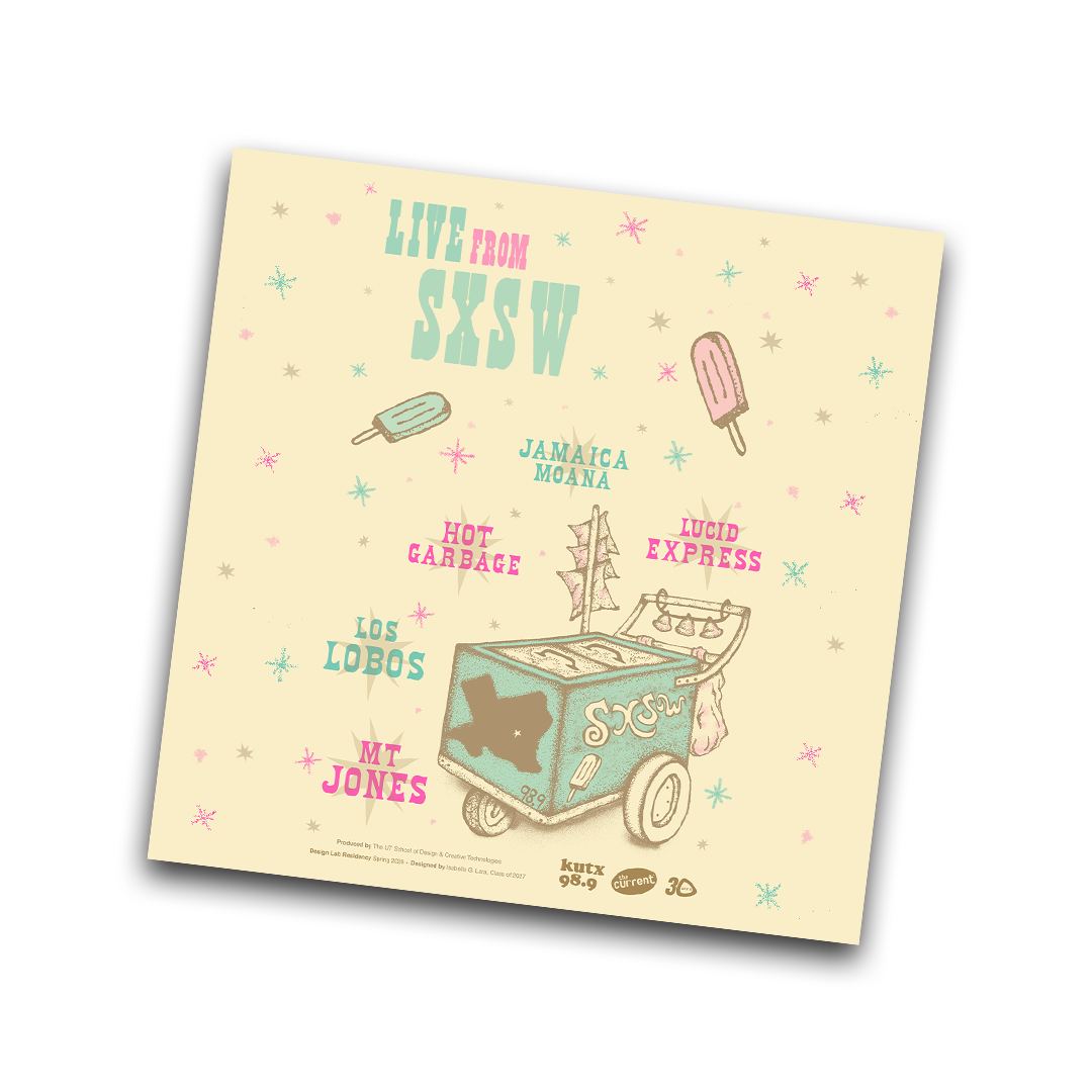
As part of this project I was offered the opportunity to design a
poster for SXSW’s Public Radio Day stage concert.
Public Radio day stage is a free public concert series hosted by
Austin’s NPR station (KUT/KUTX) alongside other prominent public
radio music stations across the country.
Mediums
Illustrator
Photoshop
RISO
Pen + Pencil
Research + Experimenting
As a Latina born and raised in Texas I usually try to see how I can
incorporate my roots or the local communities into my work in
some way. Before I fully began this project I had already been
toying with the idea of making a poster that depicted a paleta
cart in some form, So when I was offered the opportunity to
design this poster I instantly thought about how this idea would
be perfect.
I immediately started to sketch out some ideas and really just
played around with how to layout the poster. I would say the most
entertaining part of this project was deciding the medium was
going to be RISO.
This was the first time I had ever worked with this format at such
a big scale. It was really fun to experiment with how these colors
would be printed out. I had to research a lot about using the
printer and learn to let go of the idea of something being
“perfect” in the printing process since.
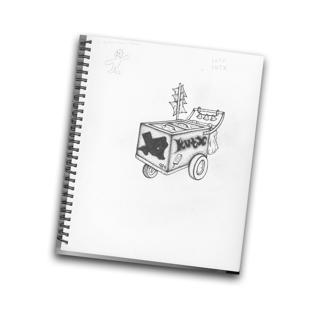
The paleta cart I drew by hand
The Social Media Post
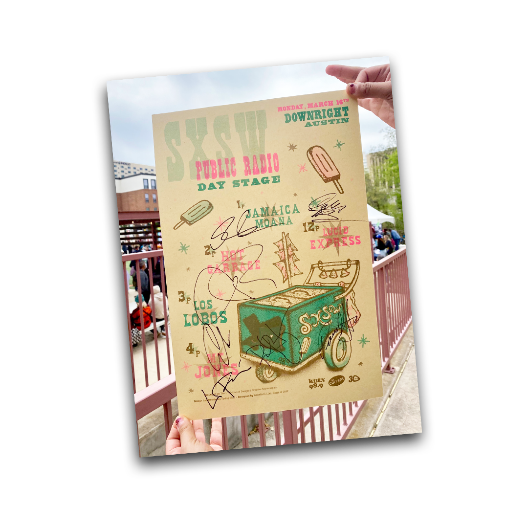
An attendee’s signed poster
Final Assets
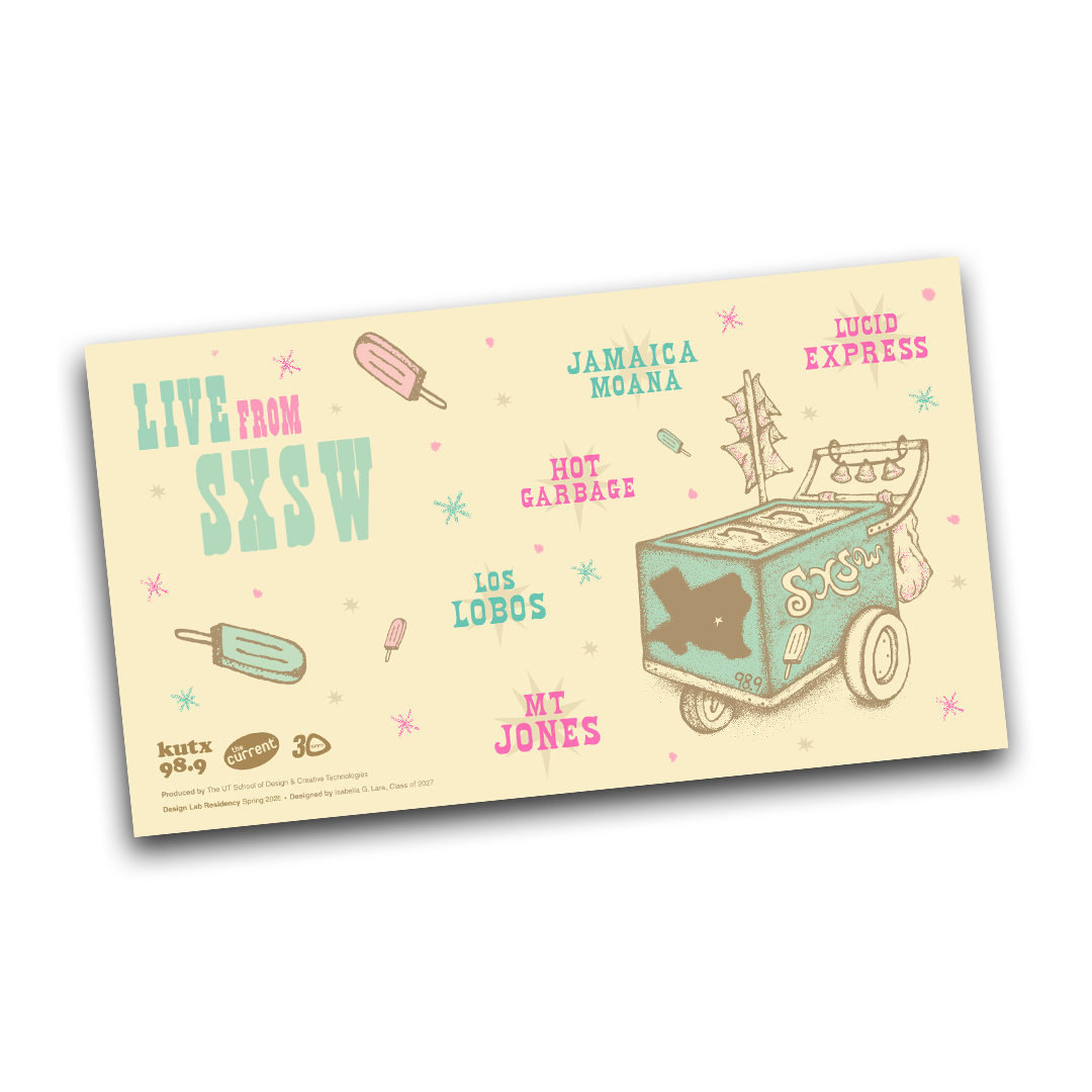
While in the process of printing I was also asked to format the
designs for social media as a way to market the concert.
Once the posters were finalized we packed them all up and gave
them away to folks who attended the concert!
.
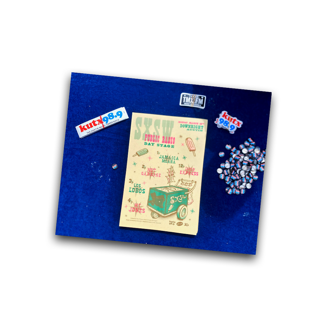
Finalized Posters
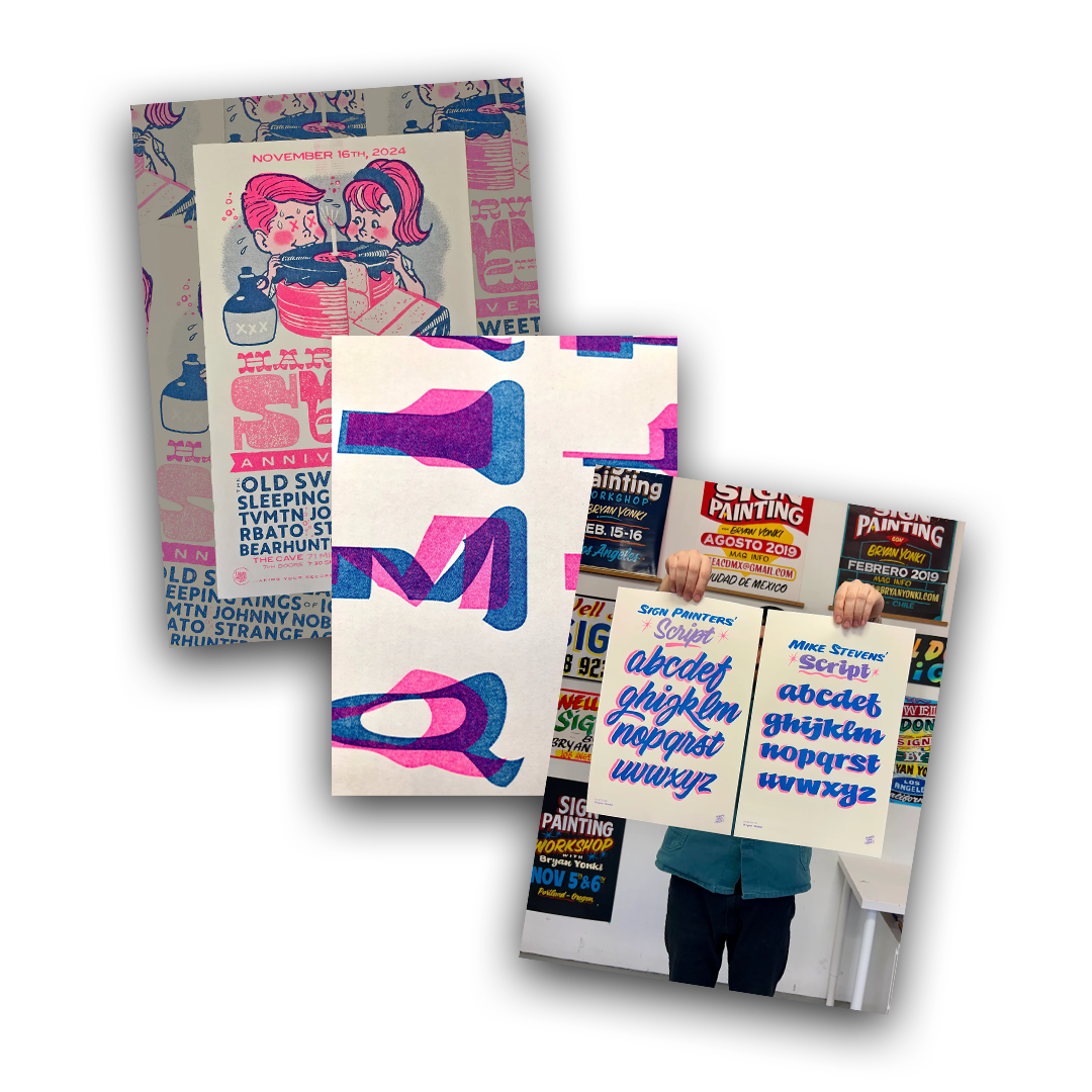
Riso color inspo
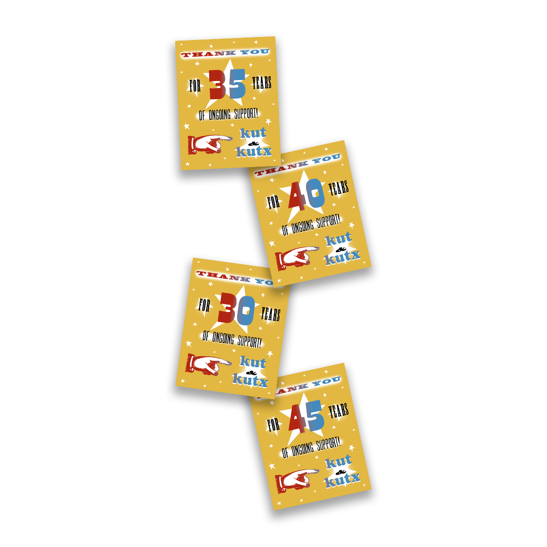
Concept 1 of thank you cards
KUTX/KUT Thank You Cards
November 2025 - March 2026
Project Prompt
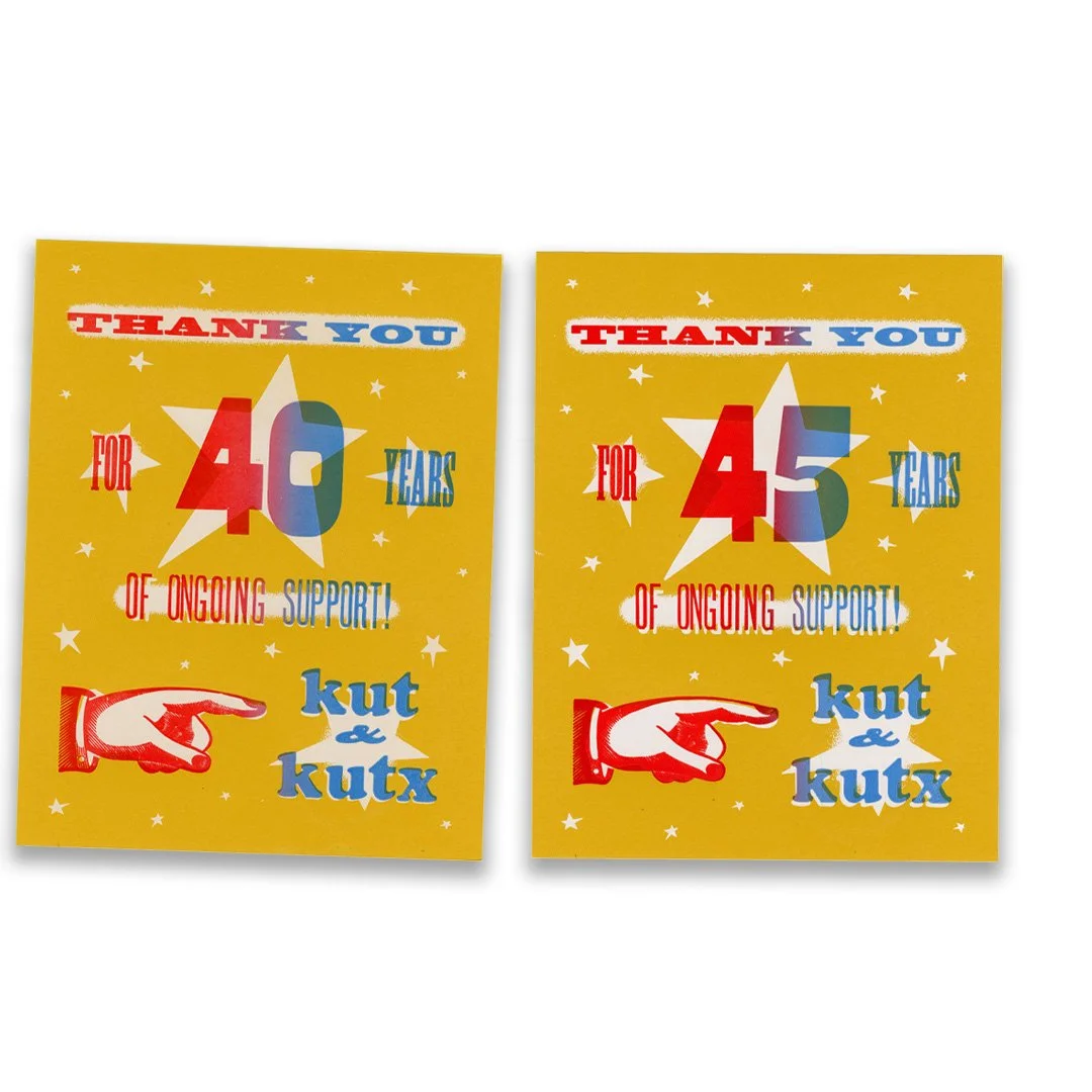
As part of this project I was commissioned to create thank you
cards for KUT and KUTX. These cards would be mailed out to their
supporters based off how many years they donated.
Out of all the projects completed under my residency with the
design lab this one would be the most time consuming.
We were tasked with printing a total of 315 cards.
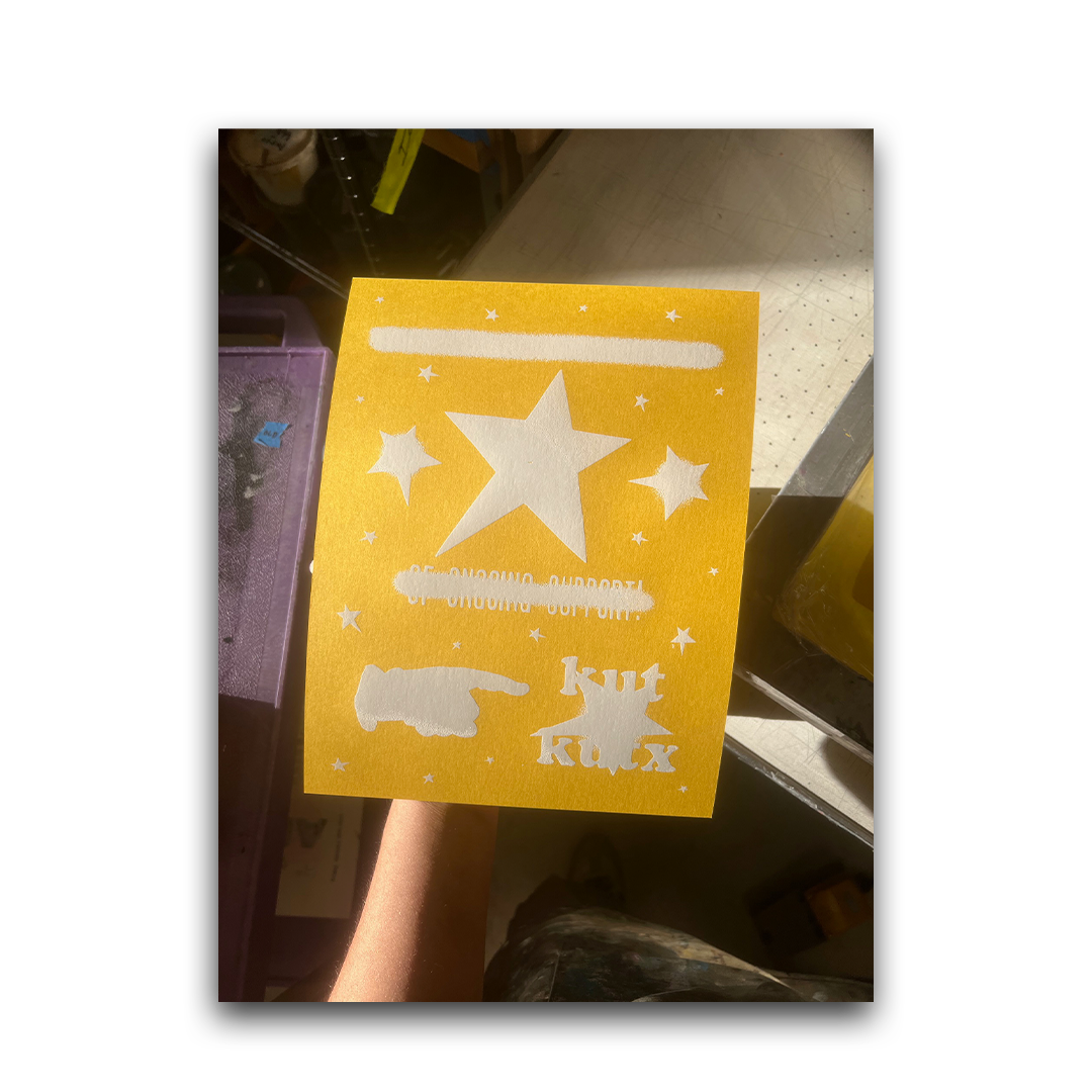
The process for printing these cards consist of
Screen print white ink on top of all cards
Lock my type up on the press
Roll out black ink only (original idea)
Roll out red to blue gradient ink (Change number)
However we would have to remove the number 4x from the bed
which involves a lot of cleaning + and time.
Mediums
Illustrator
Photoshop
Screenprint
Letterpress
Process + Set up
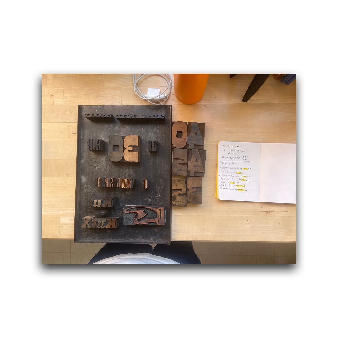
The first obstacle I had to tackle when facing this project was
trying to establish what type I would actually be able to use from
our collection. Due to the small scale that these cards were
going to be printed at I had to take inventory of what type was
available and what would fit on an 8 ½ x 11 paper.
There was a bit of going back and forth between which fonts
would be the best. I would often select a type then realize it
would not fit on the paper or take up way to much space.
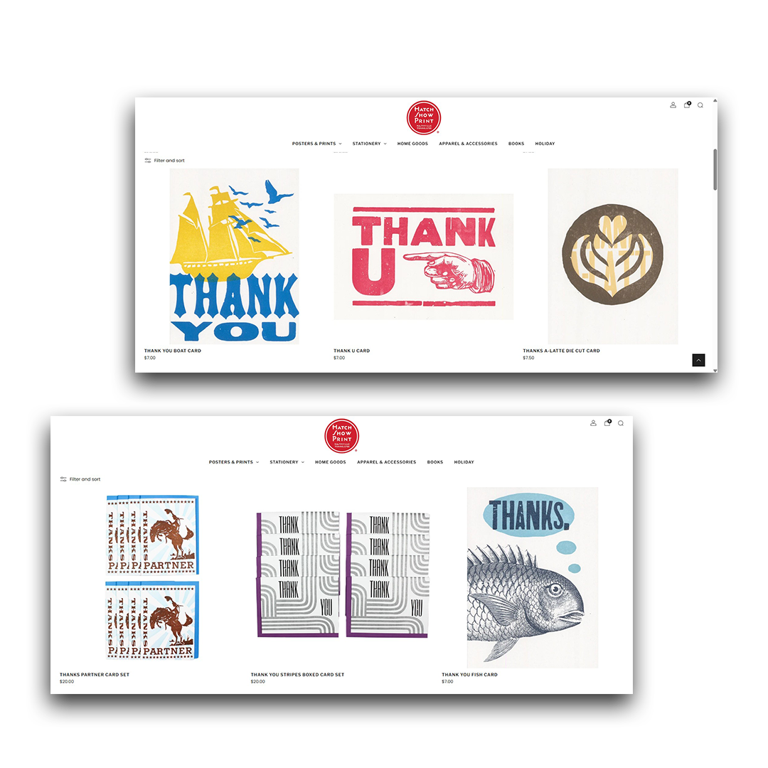
I immediately looked to one of my favorite print shops for
inspiration. I loved how Hatch show print had this rustic very
obvious woodtype look to it. In return I turned to my collection
and selected pieces that screamed this is woodtype! (such as
the hand index)
One example of the 300+ cards I had to manually screen print
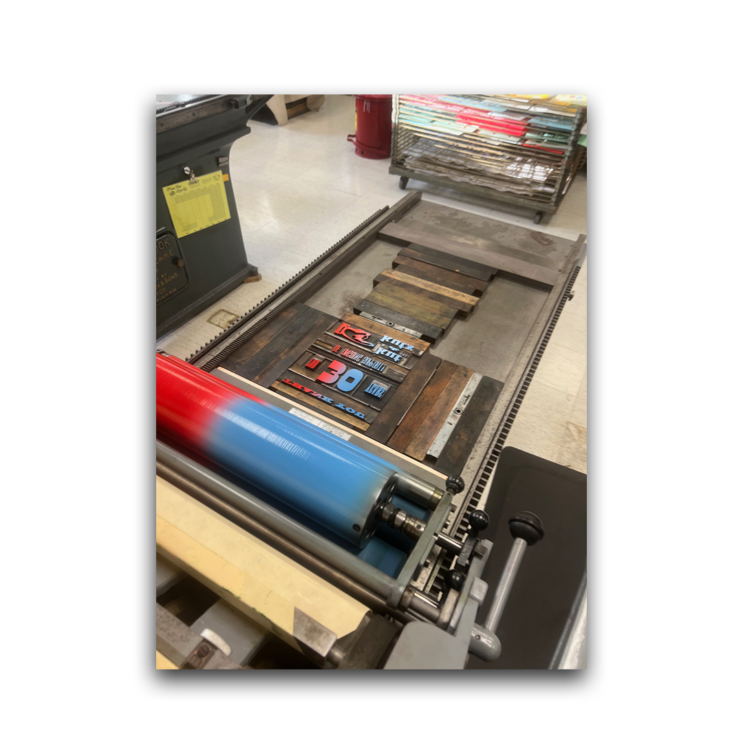
The gradient layer on the thank you card “30”
Part 1 - Set up!
Once I established which type I would use, I set up my galley tray
to get an idea of how to organize my type.
I then began the long process of aligning my type with the paper I
would be printing on.
After numerous hours of bending over, crouching on the ground,
picking at type with tweezers, placing furniture and removing
furniture - I was able to get it aligned.
Part 2 - Inking
Once I established which type I would use, I set up my galley tray
to get an idea of how to organize my type.
I then began the long process of aligning my type with the paper I
would be printing on.
After numerous hours of bending over, crouching on the ground,
picking at type with tweezers, placing furniture and removing
furniture - I was able to get it aligned.
After screen-printing each card I could begin inking the rollers for
the other layers.
All the final thank you cards scanned
Hatch Show Print - Thank you Cards I used as inspo
A picture of my final selected type
Part 3 - Final cards
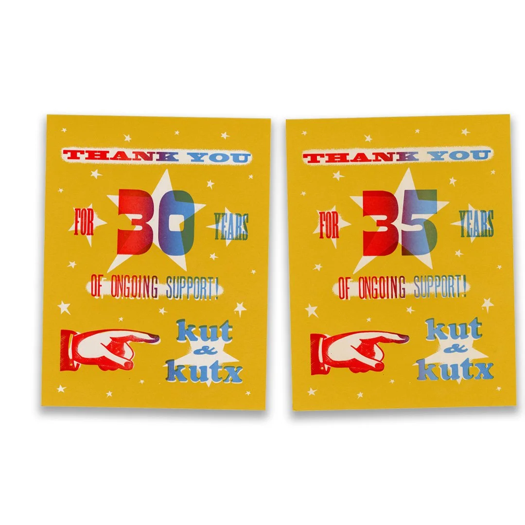
After repeatedly inking the rollers my team and I made the choice
to eliminate our black layer. We found that it not only saved time
but we loved how much the gradient was coming out. Once we
finished the cards we sent them off to KUTX to mail them to all of
their supporters!
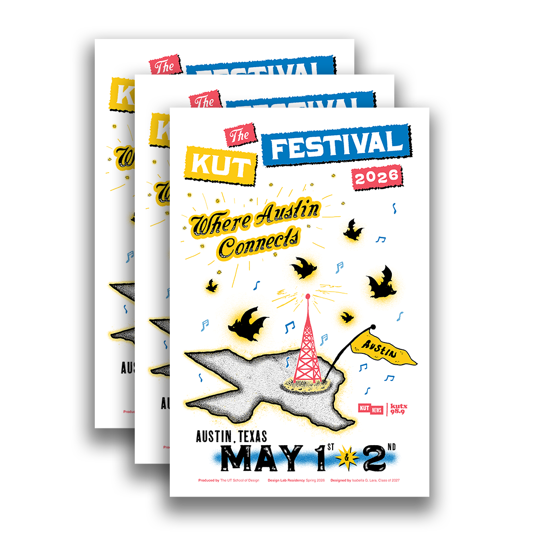
Final KUT Fest Posters
The KUT Festival
May 2026 - 2 weeks
Project Prompt
For my last project of my residency I was commissioned to design
posters for KUT’s first ever KUT Fest!
KUT Fest was created as a two day festival that celebrates the
people, ideas, music and culture that make Austin “Austin.”
It was such an honor to not only be able to help out KUT with this
poster, but to also help support Austin’s local community.
Mediums
Illustrator
Photoshop
RISO
Pencil + Pen
Research + Sketches
Going into this project I started to brainstorm things that I could
draw that depicted Austin and Texas as a whole, since many
speakers where from all over the state. I wanted to be mindful of
what I chose to draw as well because I personally believe that a
lot of Austin symbols are reused over and over again.
Concept 1
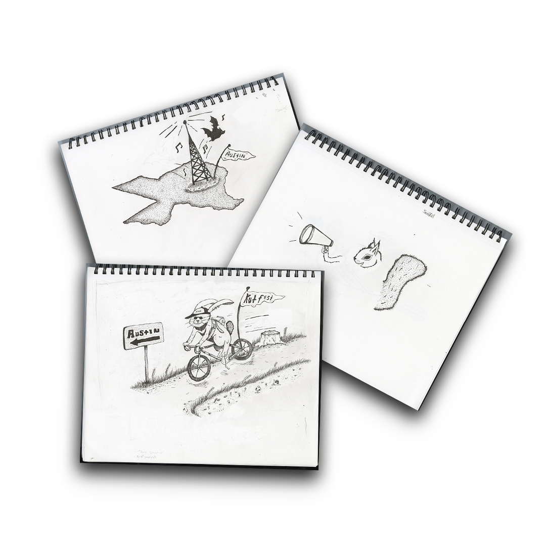
I started off with the idea of creating a whole scene where there
was a forest and an Austin critter on its bike, he would be shown
making his way to KUT Fest. My team decided that although this
drawing was fun, it might be seen as a bit too child like.
Concept 2
My next concept, which would be my final design was a radio
tower that would be protruding out of Texas, representing Austin.
I decided that bats would be the best critter to place considering
how Austin is known for its bat bridge.
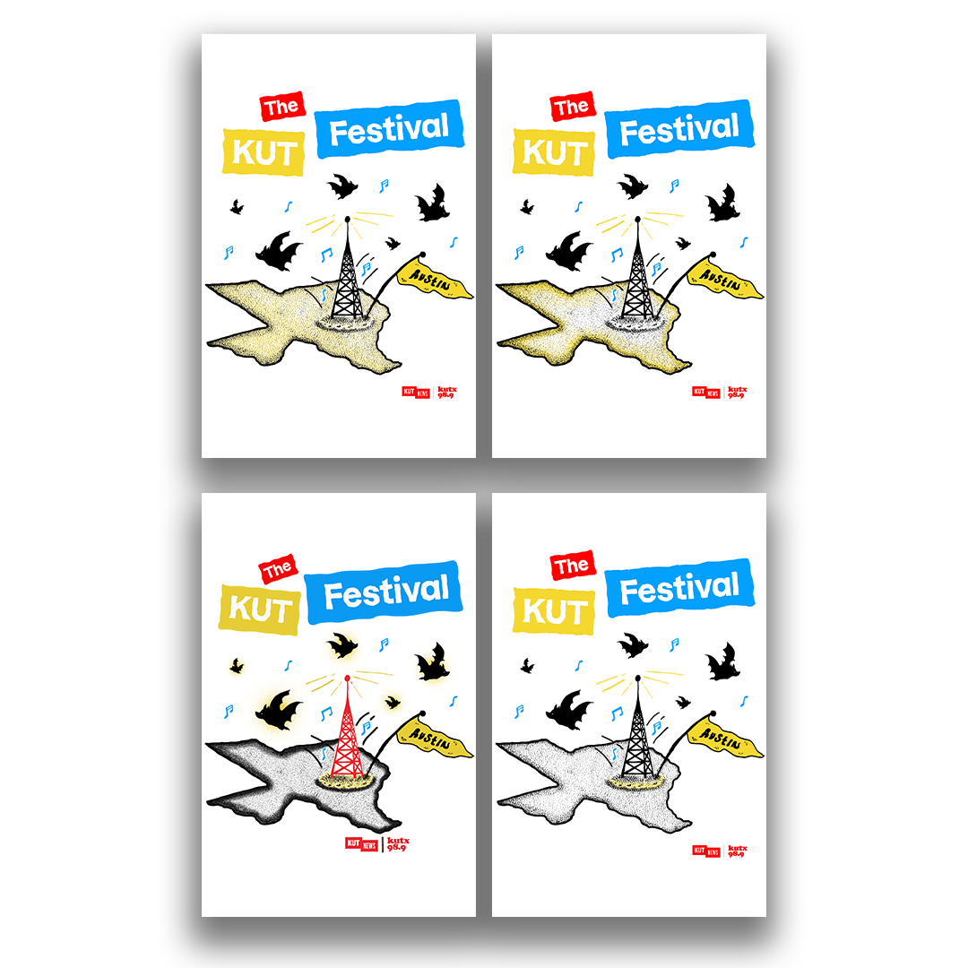
Different Color Iterations
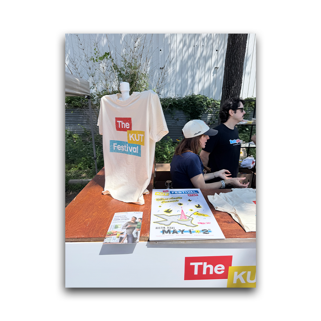
The posters at the shop booth
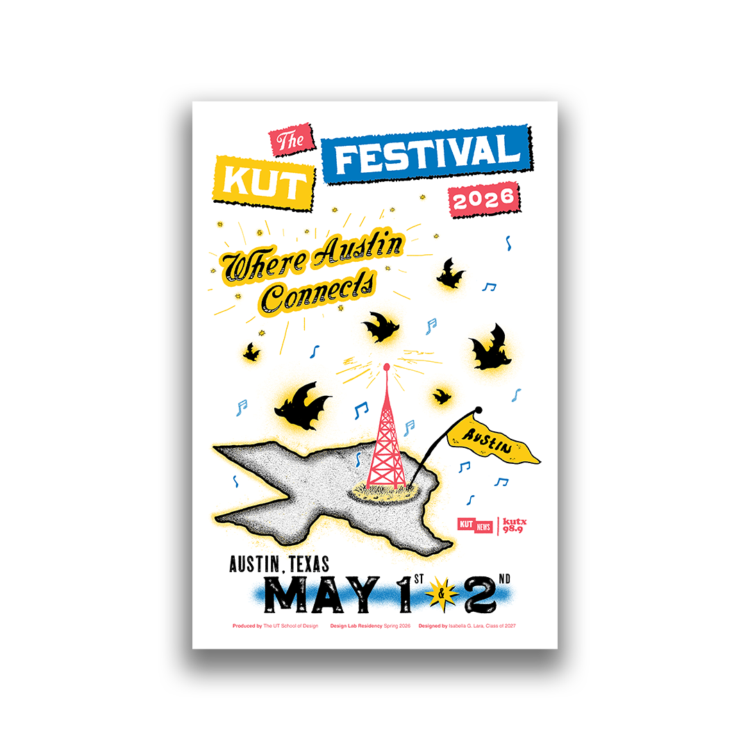
Final Poster Design
Multiple iterations
After finalizing the design that I was going to use for the poster, I
decided the medium I would use was RISO. I then played around
with different ways to utilize color.
This is an important part of my print process, no matter what
medium I plan on using. I really try to utilize the colors and take
advantage of each layer as much as possible.
Finalize Design
Now that I settled on which colors the poster would be It was
time for the printing process! I would print a little over 100+
posters and send them of to the KUT Fest Where they would be
sold to support the community.
Sketches I created